Kim Scheinberg on Nostr: I don't know which flavor of neurodivergence this is, but this logo is killing me I ...
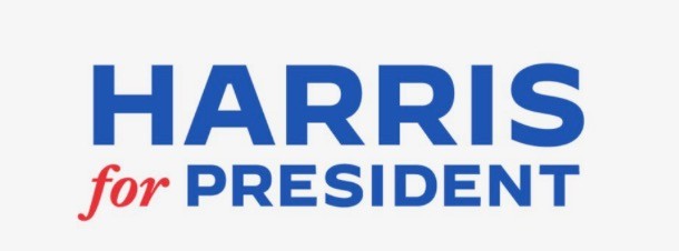
I don't know which flavor of neurodivergence this is, but this logo is killing me
I feel certain that if I took a ruler to it, the 'for' and 'PRESIDENT' align perfectly. But because of the different colors, style, and case, visually it *seems* that the 'for' is just a bit below the 'PRESIDENT"
Not by much, maybe only 1/16 or 1/32 of an inch, but by just enough for it to trigger my "please make it stop" reflex. The [presumably] unintended optical illusion is maddening.
Is it just me?

Published at
2024-07-27 18:04:15Event JSON
{
"id": "1c8f25f22ed1fff9c99e136eac440bbd9e7d85f10520857c9502c563467deedf",
"pubkey": "dcd5b2889bcf7f5b29ca261b3b98adb596f9be9641cca10f66cd1ebd5c024aea",
"created_at": 1722096255,
"kind": 1,
"tags": [
[
"imeta",
"url https://media.mas.to/media_attachments/files/112/859/292/853/693/193/original/58430bb361f77f3c.jpeg",
"m image/jpeg"
],
[
"proxy",
"https://mas.to/@kims/112859300187120816",
"web"
],
[
"proxy",
"https://mas.to/users/kims/statuses/112859300187120816",
"activitypub"
],
[
"L",
"pink.momostr"
],
[
"l",
"pink.momostr.activitypub:https://mas.to/users/kims/statuses/112859300187120816",
"pink.momostr"
],
[
"-"
]
],
"content": "I don't know which flavor of neurodivergence this is, but this logo is killing me\n\nI feel certain that if I took a ruler to it, the 'for' and 'PRESIDENT' align perfectly. But because of the different colors, style, and case, visually it *seems* that the 'for' is just a bit below the 'PRESIDENT\"\n\nNot by much, maybe only 1/16 or 1/32 of an inch, but by just enough for it to trigger my \"please make it stop\" reflex. The [presumably] unintended optical illusion is maddening.\n\nIs it just me?\nhttps://media.mas.to/media_attachments/files/112/859/292/853/693/193/original/58430bb361f77f3c.jpeg\n",
"sig": "f6d70324d491884bab98af0077613d660720bf63f4876f559e2e1dd8bd4a5fcdc40a4f80ec32b5b25b1da499e18ae236fa05eb005f4b8865b7eac56c957cc865"
}
